Even though there will be no prizes awarded I am submitting the following to photos on behalf on the Bathurst Camera Club for a rival inter-club competition. They had sent us 34 images for us to judge and now it is our turn to send photos back.
I am so nervous about being judged for the first on my photography and Photoshop work. The only one that was not enhanced is the black and white image of the goat. All I did was re-size the image.
This blog is part of Certificate IV Photo Imaging, Bachelor of Arts (Graphic Design), Certificate IV in Design, Certificate IV Digital Media, and Certificate III Media. Please feel free to leave a comment, provided it is nice. Enjoy. Thanks Carolyn
Tuesday, April 23, 2013
Wednesday, April 10, 2013
Uni - Fundamentals of Design 1
Topic 5 - Final Submission
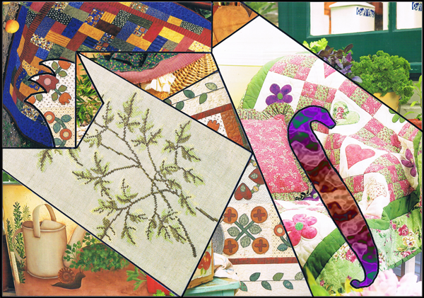
I am quite pleased with how this turned out. I used Photoshop, symbols from Illustrator and textures from Filter Forge. First image is the skeleton/design of the final image.
My final design. Abstract - Always time for a cuppa.
I am quite pleased with how this turned out. I used Photoshop, symbols from Illustrator and textures from Filter Forge. First image is the skeleton/design of the final image.
My final design. Abstract - Always time for a cuppa.
Sunday, April 7, 2013
Uni - Fundamentals of Design - Topic 5
Coherence = unity and variety: the only rule there is.
The viewer and the designer have one thing in common; they are both searching for the perfect sense of harmony – a preferred sense of ‘unity’ or order that the eye searches for in relationships between the elements of any image.
The only difference is that each approaches this need from opposite ends of the design process.
The viewers’ brain is hard-wired to search for relationships in what they see – looking for coherence and a sense of a ‘whole’; for any evidence of a planned and logical arrangement in an image. In a sense, to find a means of dismantling the design beginning with a focal point from which their eye may move around an image discovering a seemingly planned order with some variety through a number of basic patterns – passages of light and dark; linear patterns; colour patterns within the design or perhaps passages of related textures, shapes or forms.
The designer however has to search to find the best way of building this order in the design from scratch. To achieve a sense of harmony by arranging varied, often disparate elements into a coherent order to achieve a unified composition; a planned sequence of groupings and coordinated arrangements of major and minor elements – a visual hierarchy of dominant, sub-dominant and subordinant elements as a series of overlapping or integrated patterns or systems of organising the elements to ensure the viewer discovers a sense of coherence that results from an integration of unity and variety.
As Jack Myers notes there are two ways of achieving harmony in a design:
By establishing a sense of coherence and by managing visual interest.
Coherence: is achieved through principles of gestalt such as proximity: continuity, similarity or repetition; rhythm; closure to produce a sense of order.
Visual interest is the management of dominant forces of balance; orientation; attraction; assimilation; space; change and psychological force.
The original image. Patrick Caulfield - Still Life With Dagger
Highlighting the linear patterns, similarity and repetition and patterns and colour.
Next I lifted the pattern off the image and onto a blank sheet of paper.
Then scanned the above and edited it in Photoshop and came up with my final design.
Scanned the images from the magazines as they are too nice to cut up!
The viewer and the designer have one thing in common; they are both searching for the perfect sense of harmony – a preferred sense of ‘unity’ or order that the eye searches for in relationships between the elements of any image.
The only difference is that each approaches this need from opposite ends of the design process.
The viewers’ brain is hard-wired to search for relationships in what they see – looking for coherence and a sense of a ‘whole’; for any evidence of a planned and logical arrangement in an image. In a sense, to find a means of dismantling the design beginning with a focal point from which their eye may move around an image discovering a seemingly planned order with some variety through a number of basic patterns – passages of light and dark; linear patterns; colour patterns within the design or perhaps passages of related textures, shapes or forms.
The designer however has to search to find the best way of building this order in the design from scratch. To achieve a sense of harmony by arranging varied, often disparate elements into a coherent order to achieve a unified composition; a planned sequence of groupings and coordinated arrangements of major and minor elements – a visual hierarchy of dominant, sub-dominant and subordinant elements as a series of overlapping or integrated patterns or systems of organising the elements to ensure the viewer discovers a sense of coherence that results from an integration of unity and variety.
As Jack Myers notes there are two ways of achieving harmony in a design:
By establishing a sense of coherence and by managing visual interest.
Coherence: is achieved through principles of gestalt such as proximity: continuity, similarity or repetition; rhythm; closure to produce a sense of order.
Visual interest is the management of dominant forces of balance; orientation; attraction; assimilation; space; change and psychological force.
The original image. Patrick Caulfield - Still Life With Dagger
Highlighting the linear patterns, similarity and repetition and patterns and colour.
Next I lifted the pattern off the image and onto a blank sheet of paper.
Then scanned the above and edited it in Photoshop and came up with my final design.
Scanned the images from the magazines as they are too nice to cut up!
Saturday, March 30, 2013
TAFE - Logo Designs
This weeks work consisted of creating a logo following the Lynda course "Designing a Logo" with Nigel French and basically it is a computerised version of what we can do in Illustrator until we choose our final design. I learnt so much with what I can do with Illustrator. Below are my final selections. Let me know what you think!
Tuesday, March 26, 2013
Uni - Final Postcard Series
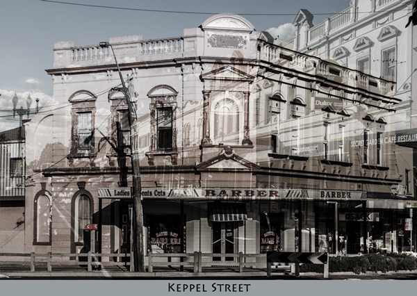
Here are my final four postcards.
Font used:
On the front I used - Opificio
On the back I used - Lithos Pro and Happy Monkey
The plain backgrounds were created using the eye dropper tool to pick up the colour from the image.
With the images I edited them in Camera Raw. I upped the Clarity and downed the Vibrance and Saturation to get that almost washed out colour look.
When combining the two images on the postcard I used 'Overlay' on the top image.
All photos were taken with a Nikon D5100 camera and edited in Camera RAW before importing to Photoshop.
And for shits and giggles Mount Panorama.
Font used:
On the front I used - Opificio
On the back I used - Lithos Pro and Happy Monkey
The plain backgrounds were created using the eye dropper tool to pick up the colour from the image.
With the images I edited them in Camera Raw. I upped the Clarity and downed the Vibrance and Saturation to get that almost washed out colour look.
When combining the two images on the postcard I used 'Overlay' on the top image.
All photos were taken with a Nikon D5100 camera and edited in Camera RAW before importing to Photoshop.
And for shits and giggles Mount Panorama.
Sunday, March 24, 2013
Uni Topic 3 – Intersections and Border Crossings
The first two are using photos I have taken along with the symbol that I created.
The photos are of Amber taken in the Australian Fossil & Mineral
Museum. The back ground reminded me of space and Amber is very old.
My symbol partly represents a hand of a clock, which is time. The circle encompasses space.
The next two are created using the images I made with wet and dry media and my symbol again appears.
This is just some of the work that I do for my second subject at Wagga Wagga CSU.
My symbol partly represents a hand of a clock, which is time. The circle encompasses space.
The next two are created using the images I made with wet and dry media and my symbol again appears.
Friday, March 22, 2013
University - Postcards Continued
Here we go again. I like the overlays I have done with these postcards. I also have washed out the colours. Now I have to think of something quirky to put on each postcard. Also which Junktion Postcard do you think I should use?
Subscribe to:
Posts (Atom)