Coherence = unity and variety: the only rule there is.
The viewer and the designer have one thing in common; they are both searching for the perfect sense of harmony – a preferred sense of ‘unity’ or order that the eye searches for in relationships between the elements of any image.
The only difference is that each approaches this need from opposite ends of the design process.
The viewers’ brain is hard-wired to search for relationships in what they see – looking for coherence and a sense of a ‘whole’; for any evidence of a planned and logical arrangement in an image. In a sense, to find a means of dismantling the design beginning with a focal point from which their eye may move around an image discovering a seemingly planned order with some variety through a number of basic patterns – passages of light and dark; linear patterns; colour patterns within the design or perhaps passages of related textures, shapes or forms.
The designer however has to search to find the best way of building this order in the design from scratch. To achieve a sense of harmony by arranging varied, often disparate elements into a coherent order to achieve a unified composition; a planned sequence of groupings and coordinated arrangements of major and minor elements – a visual hierarchy of dominant, sub-dominant and subordinant elements as a series of overlapping or integrated patterns or systems of organising the elements to ensure the viewer discovers a sense of coherence that results from an integration of unity and variety.
As Jack Myers notes there are two ways of achieving harmony in a design:
By establishing a sense of coherence and by managing visual interest.
Coherence: is achieved through principles of gestalt such as proximity: continuity, similarity or repetition; rhythm; closure to produce a sense of order.
Visual interest is the management of dominant forces of balance; orientation; attraction; assimilation; space; change and psychological force.
The original image. Patrick Caulfield - Still Life With Dagger
Highlighting the linear patterns, similarity and repetition and patterns and colour.
Next I lifted the pattern off the image and onto a blank sheet of paper.
Then scanned the above and edited it in Photoshop and came up with my final design.
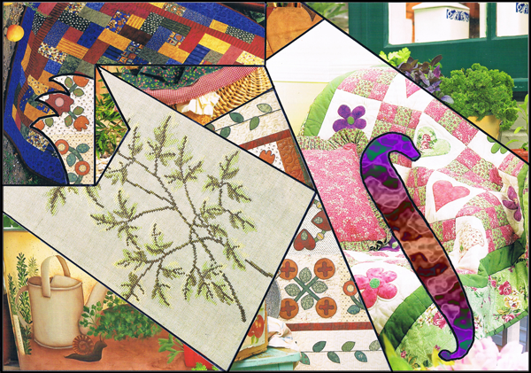
Scanned the images from the magazines as they are too nice to cut up!


No comments:
Post a Comment