
Saturday, March 30, 2013
TAFE - Logo Designs
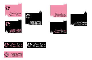
This weeks work consisted of creating a logo following the Lynda course "Designing a Logo" with Nigel French and basically it is a computerised version of what we can do in Illustrator until we choose our final design. I learnt so much with what I can do with Illustrator. Below are my final selections. Let me know what you think!
Tuesday, March 26, 2013
Uni - Final Postcard Series
Here are my final four postcards.
Font used:
On the front I used - Opificio
On the back I used - Lithos Pro and Happy Monkey
The plain backgrounds were created using the eye dropper tool to pick up the colour from the image.
With the images I edited them in Camera Raw. I upped the Clarity and downed the Vibrance and Saturation to get that almost washed out colour look.
When combining the two images on the postcard I used 'Overlay' on the top image.
All photos were taken with a Nikon D5100 camera and edited in Camera RAW before importing to Photoshop.


And for shits and giggles Mount Panorama.

Sunday, March 24, 2013
Uni Topic 3 – Intersections and Border Crossings
The first two are using photos I have taken along with the symbol that I created.
The photos are of Amber taken in the Australian Fossil & Mineral
Museum. The back ground reminded me of space and Amber is very old.
My symbol partly represents a hand of a clock, which is time. The circle encompasses space.


The next two are created using the images I made with wet and dry media and my symbol again appears.


This is just some of the work that I do for my second subject at Wagga Wagga CSU.
My symbol partly represents a hand of a clock, which is time. The circle encompasses space.


The next two are created using the images I made with wet and dry media and my symbol again appears.


Friday, March 22, 2013
University - Postcards Continued
Here we go again. I like the overlays I have done with these postcards. I also have washed out the colours. Now I have to think of something quirky to put on each postcard. Also which Junktion Postcard do you think I should use?


Thursday, March 21, 2013
TAFE - Design Brief 3 - Flyer
Design Brief 3 – Flyer
Create a 1 sided, full colour A4 promotional flyer for one of the following topics:

This is my second version of the History of Teddy Bears. I adore bears! SO would dearly love some "nice" opinions. I have threaded text for my columns, which cannot be seen outside of Adobe InDesign.
Create a 1 sided, full colour A4 promotional flyer for one of the following topics:
- Music
- Hometown / neighbourhood
- Hobby / interest group

This is my second version of the History of Teddy Bears. I adore bears! SO would dearly love some "nice" opinions. I have threaded text for my columns, which cannot be seen outside of Adobe InDesign.
Tuesday, March 19, 2013
Topic 2 Exercise 3 University
- use of figure and ground relationships and the principle of scale in 5 final designs
- use of individual sign or symbol to demonstrate an effective management of a range of effects of contrasting edges to create illusions of space and/or camouflage in 5 design outcomes
- to further recognise that many small, rapid sketches will identify the best possible outcome much more effectively than a few careful laboured studies


Workshop Two Dry Media - University
This first exercise is intended to make
you aware of the huge variety of tones and textures available to you for
design. By developing a series of experimental papers with a broad range of
tonal values you will gain the skills to effectively control and fully exploit
media and mark singly and in combination. At the conclusion of this exercise
you will have an extensive inventory of diverse textures and media combinations
for future use via copying, scanning and direct collaging.
Texture and tone provide valuable contrast, rhythm and create illusions of depth in 2 dimensional design.
Tone and tonal value refers to the
lightness or darkness of colour. In this
case a monochrome* – shades of black/grey or white.
Texture refers to combinations of marks
– points, lines shapes and tones closely arranged to create a visual sensation
of tactile qualities. Textures can be actual (e.g. sandpaper) or simulated (an
illusion of texture.) Textures can also be tonal – light or dark in value
depending on how closely the marks are arranged.
*monochrome = mono =one; chroma =
colour.
aim:
- to explore the great variety of mark and texture from wet or dry media available to the designer that can be used directly or scanned and reworked to produce even richer results (yes there are thousands more textures beyond the Photoshop layers/ menus)
- to gain skills, understanding and knowledge of media and their application alone and in combination


Workshop Two Wet Media University
This first exercise is intended to make
you aware of the huge variety of tones and textures available to you for
design. By developing a series of experimental papers with a broad range of
tonal values you will gain the skills to effectively control and fully exploit
media and mark singly and in combination. At the conclusion of this exercise
you will have an extensive inventory of diverse textures and media combinations
for future use via copying, scanning and direct collaging.
Texture and tone provide valuable contrast, rhythm and create illusions of depth in 2 dimensional design.
Tone and tonal value refers to the
lightness or darkness of colour. In this
case a monochrome* – shades of black/grey or white.
Texture refers to combinations of marks
– points, lines shapes and tones closely arranged to create a visual sensation
of tactile qualities. Textures can be actual (e.g. sandpaper) or simulated (an
illusion of texture.) Textures can also be tonal – light or dark in value
depending on how closely the marks are arranged.
*monochrome = mono =one; chroma =
colour.
aim:
- to explore the great variety of mark and texture from wet or dry media available to the designer that can be used directly or scanned and reworked to produce even richer results (yes there are thousands more textures beyond the Photoshop layers/ menus)
- to gain skills, understanding and knowledge of media and their application alone and in combination


Monday, March 18, 2013
Final Submission for Assignment Two
Students have to design a series of promotional postcards for your own city or town. These have to be original photographs that you take of your environment and /or it’s surroundings. You need to photograph places or things that you find interesting. The photos then need to be combined with text and presented as a series of four (4) postcards unique to your city or town and it’s attractions.
The photos can be of any subject matter and can be supported by any text you feel would be appropriate.
The postcards will be used to give away at different venues around the city including restaurants, hotel lobbies, shops, galleries and tourist information centres. The focus is to give the visitor a sense of the atmosphere of the city.
IMPORTANT: These postcards are aimed to appeal to a youth/young 18 - 24 demographic, so please create postcards that you would believe would appeal to this audience.
Here are my final submissions:
Thursday, March 14, 2013
Modernising Begonia House
Continuing with my theme of modernising postcards for Begonia House. I have created two more images plus I have put together a collage of postcards where I got my ideas from.


Wednesday, March 13, 2013
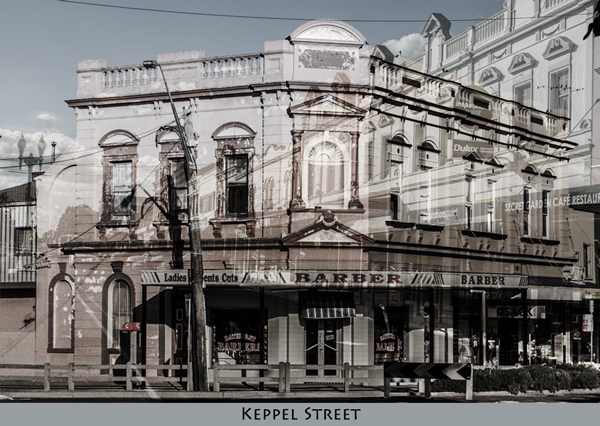
Another theme idea
As I am stumped on how to make Begonia House popular with the 18 - 24 year old demographic. I came up with another idea today. The suggestion was to take photos of Keppel Street in Bathurst NSW. So I headed out late afternoon and started to take shots of Keppel Street.

I had taken a photo of the Ben Chifley steam train and a few of Bathurst rail station, when I thought I should take a picture of the sign, in front of the train detailing information about Ben Chifley. As I looked through the view finder I realised it was reflecting the station and then the idea occurred to me, why not do the whole street in reflection for the postcard series for my university assignment. I had done some reflection shots recently for an ABC Open workshop, except they were a tad blue due to the white balance on my camera being flourescent rather than full sun. So came up with the idea of calling them 'Keppel Street in Reflection'. Below are a few shots I took.


I love the old Masonic Hall which is now a restaurant. I was taking the reflection from an office building just down the road when this guy came out and asked what I was doing. I explained I was doing an assessment for University and also for the ABC Open 'Reflections" theme and showed him the photos. Most embarrassing but worth the shot!
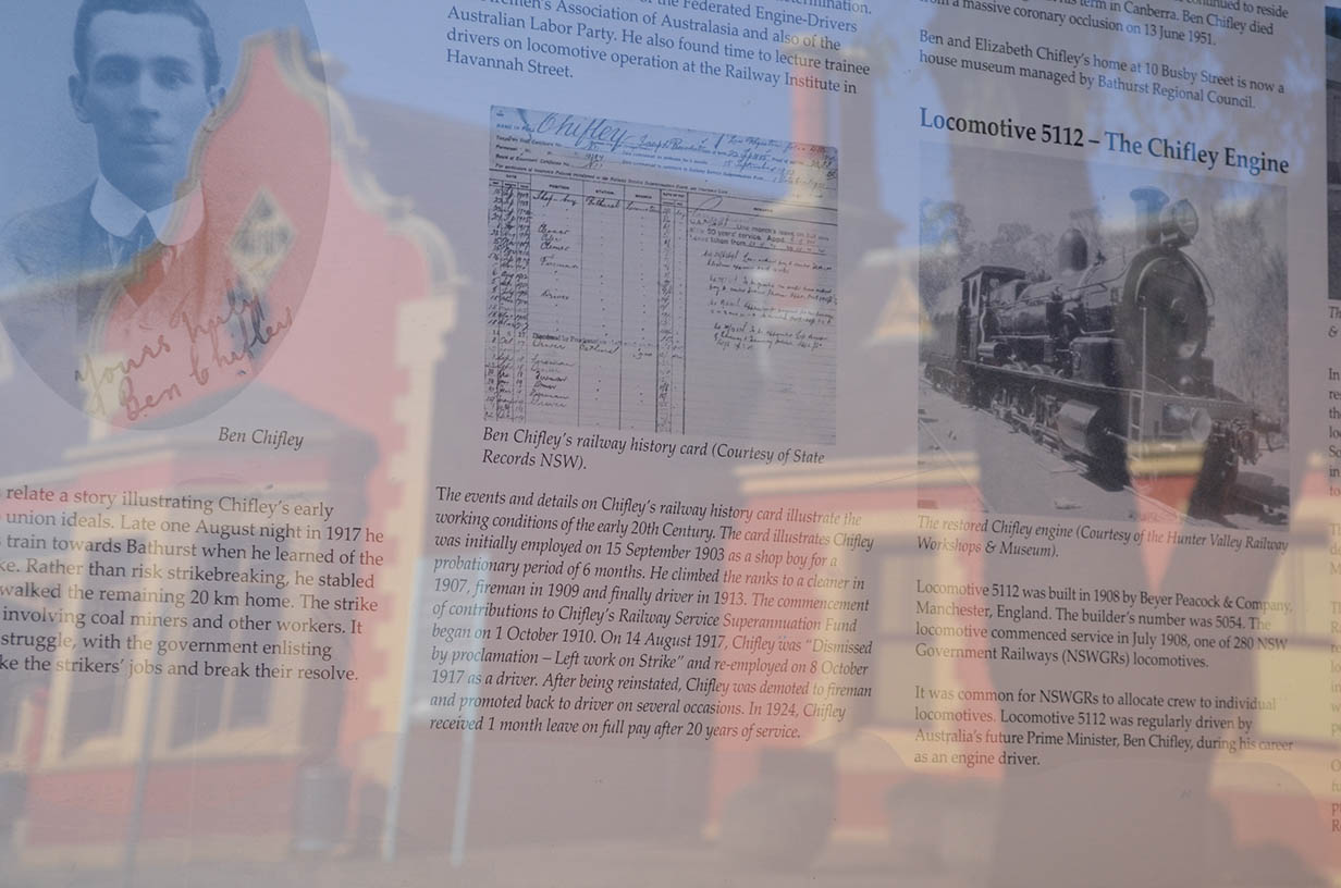

Subscribe to:
Posts (Atom)